Individual Project • Client Project

Background
Bangkok Lime is a Thai food small business in Solo, Indonesia, founded by a Thai owner who saw the lack of authentic Thai cuisine in the city. Most existing options had been adapted to local tastes, creating a gap for a more genuine experience. Bangkok Lime was established to offer original recipes and traditional cooking methods, positioning itself as an authentic Thai food brand.
The name “Bangkok Lime” reflects this identity, combining the origin of the cuisine with its signature fresh and sour flavor profile. Despite having a clear concept and strong product differentiation, the business does not yet have a defined visual identity or brand direction, limiting how effectively it communicates its value.

Problem
Bangkok Lime lacks a cohesive visual identity to clearly express its positioning as an authentic Thai food brand. This makes it difficult to differentiate from competitors and creates inconsistency across brand applications. As a result, the brand’s message and recognition are not fully optimized.
A key challenge is translating the client’s request to include Thai alphabets, a lime symbol, and the Thailand flag into a clear visual solution. Without proper hierarchy and simplification, these elements risk creating a logo that is overly complex. The task is to balance these elements into a cohesive identity that remains clear, authentic, and recognizable.
Solution
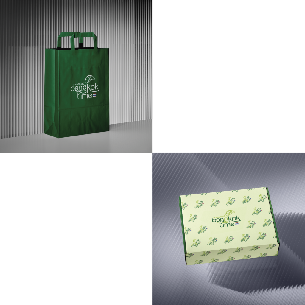
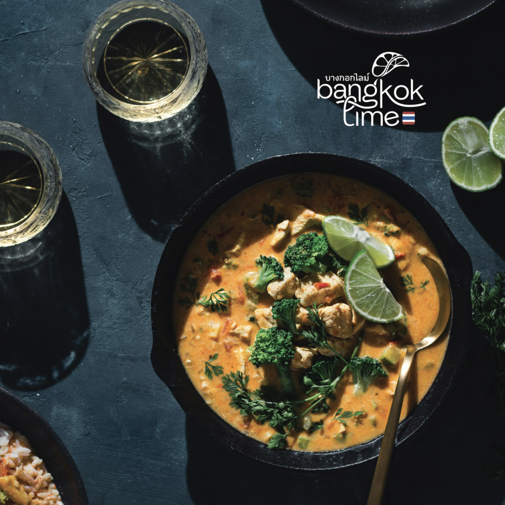
The proposed solution is to develop a cohesive visual identity system that translates Bangkok Lime’s authentic Thai positioning into a clear and recognizable brand expression by balancing Thai typography, lime symbolism, and references to the Thailand flag through simplification and strong visual hierarchy. The identity prioritizes clarity and versatility so it can adapt across different backgrounds while maintaining consistency and cultural authenticity.
In the logo, the lime is expressed as if being squeezed into the typography, creating a direct connection to the brand’s fresh and sour flavor profile. The Thai alphabet is placed neatly alongside the English name to maintain clarity while reinforcing authenticity, while subtle noodle-like curves inspired by Pad Thai are integrated into the tails of the letterforms. This results in a logo that feels distinctive, culturally rooted, and easy to apply across different contexts.