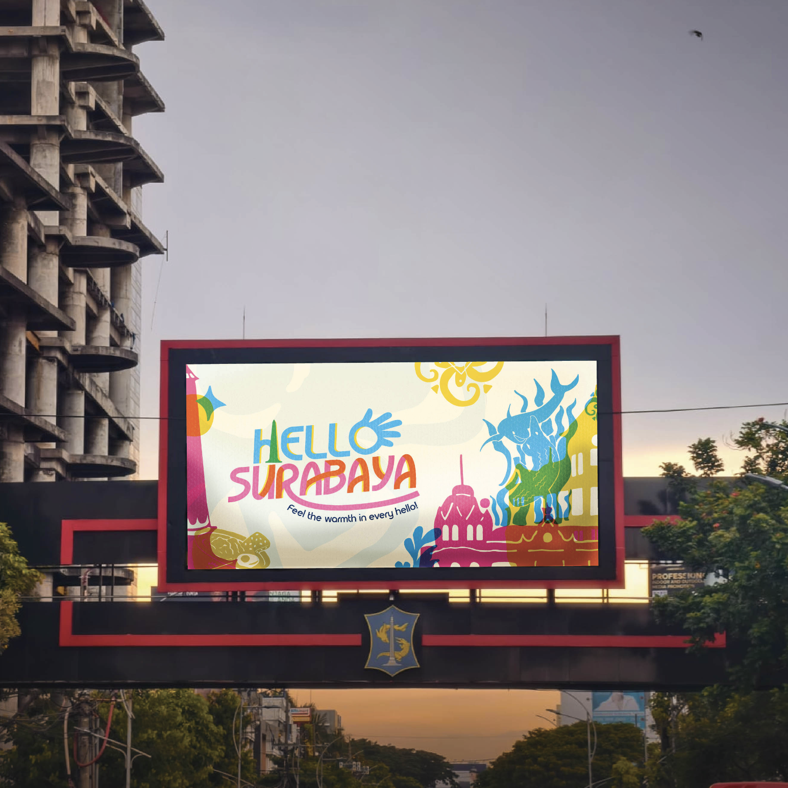
Group Project • Logo & Graphic Designer
Background
City branding Hello Surabaya aims to modernize Surabaya’s image and identity, making it more relevant, inclusive, and representative of its citizens. It fosters a sense of courage, diversity, and togetherness, creating an emotional connection between the city and its users, both locals and tourists.
Despite being a city brand for nearly 20 years, public awareness of “Sparkling Surabaya” remains low, especially among Gen-Z. Only 49.2% of local residents know the brand, with even lower awareness among Gen-Z. This gap highlights the disconnect between branding goals and acceptance, particularly among Gen-Z’s significant role in digital media consumption.

Problems
Surabaya needs a relevant and authentic city branding, which reflects the spirit of its resilient and empowered citizens, as well as an inclusive and multicultural city identity. Without a strong emotional connection with local residents, nomads, and tourists, the city’s branding is currently unable to form a clear strategic position at the national or global levels.
- Sparkling Surabaya does not yet have a strong core message, so the direction of brand communication feels less directed and less attractive.
- The audience segment has not been clearly defined, which causes the language approach and communication strategy to be on target.
- Surabaya’s branding paradigm still imitates other tourist cities, without highlighting the potential and uniqueness of its own city.
Solution
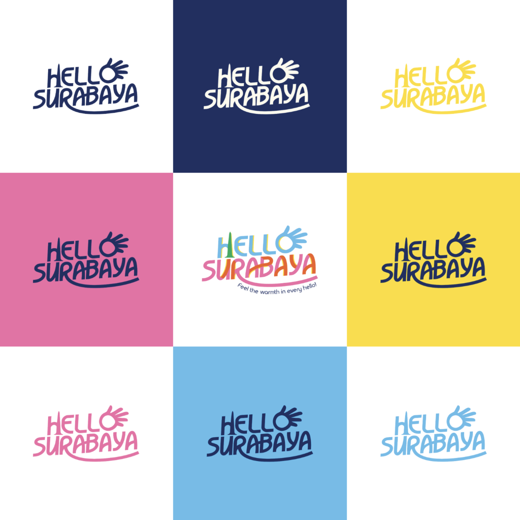
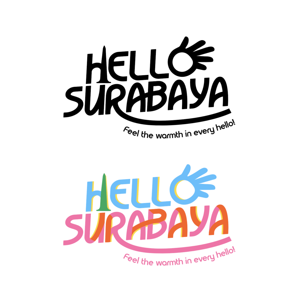
Hello Surabaya is not just a slogan, but an open invitation for everyone, including locals, newcomers, and visitors, to truly meet the city. It encourages people to engage with Surabaya beyond the surface, to experience its history, embrace its cultural diversity, and navigate its modern urban life.
Through inclusive and welcoming experiences, Hello Surabaya fosters a sense of emotional connection. It shifts the role of the audience from passive observers to active participants, inviting them not only to see the city, but to experience it and become part of a Surabaya that is alive, evolving, and open to all.
Design Decision
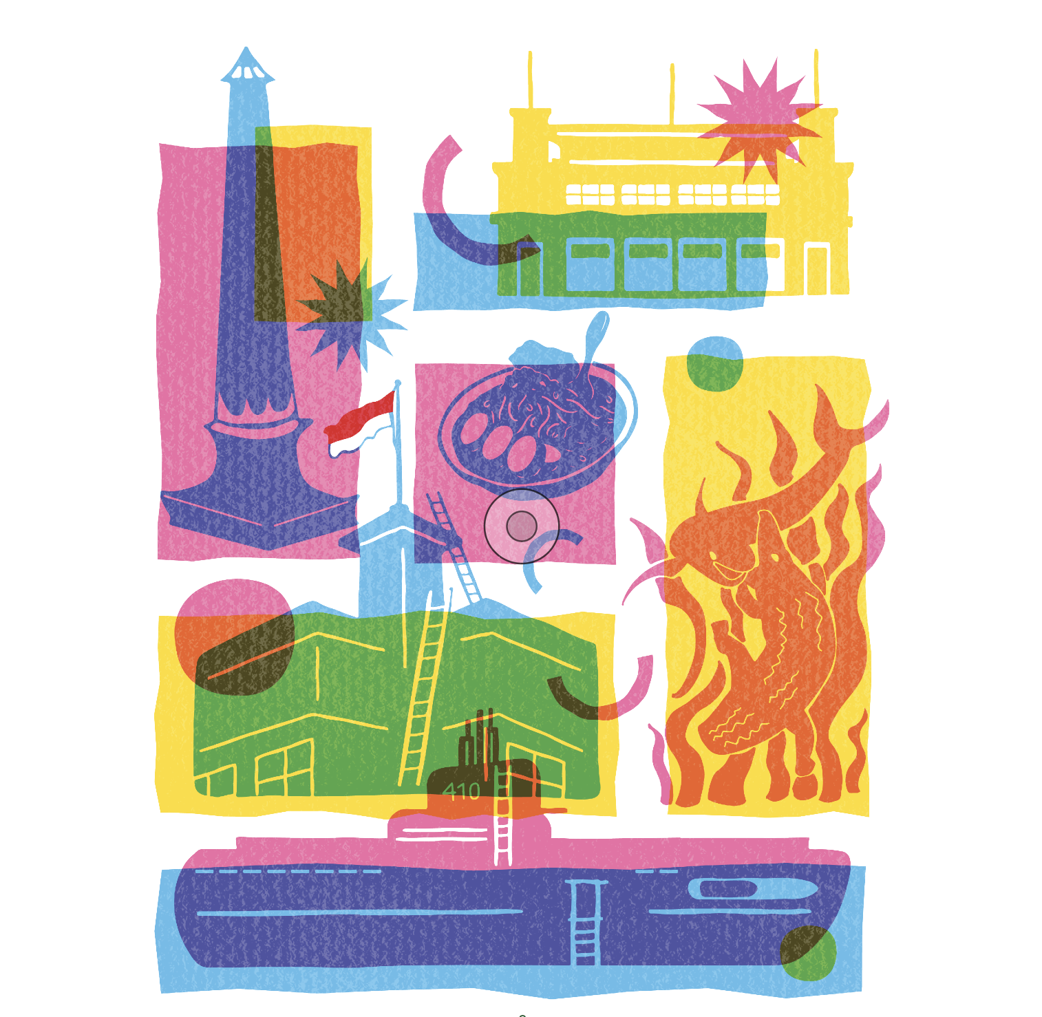
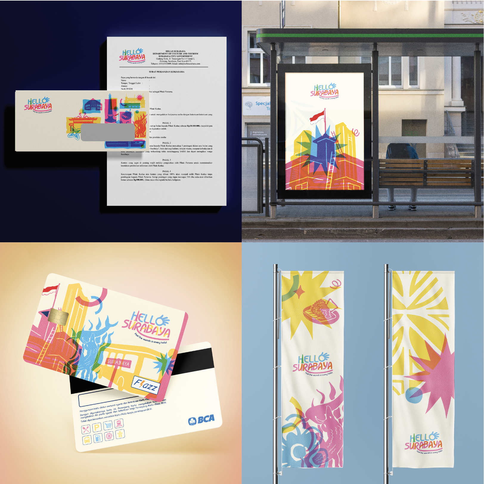
The visual direction adopts a risograph-inspired style, a printing technique similar to screen printing, known for its vibrant colors and naturally imperfect textures. This characteristic creates a distinct aesthetic often described as “perfect imperfection.”
This approach was intentionally chosen to reflect Surabaya’s authentic and unfiltered character. Rather than striving for visual precision, the imperfections introduce a more human and approachable quality, strengthening emotional connection and inclusivity (Gobé, 2010). Additionally, the overlapping colors and layered compositions in risograph visuals symbolize the coexistence of diverse cultures, communities, and modern influences that shape the city.